Air Quality Maps

Air quality and Air Quality Index (AQI) in the living environment are essential for human health and well being. Awareness for the clean and livable air is supported by online maps sharing real-time data about the state of the air.
Text by Krasimira Georgieva

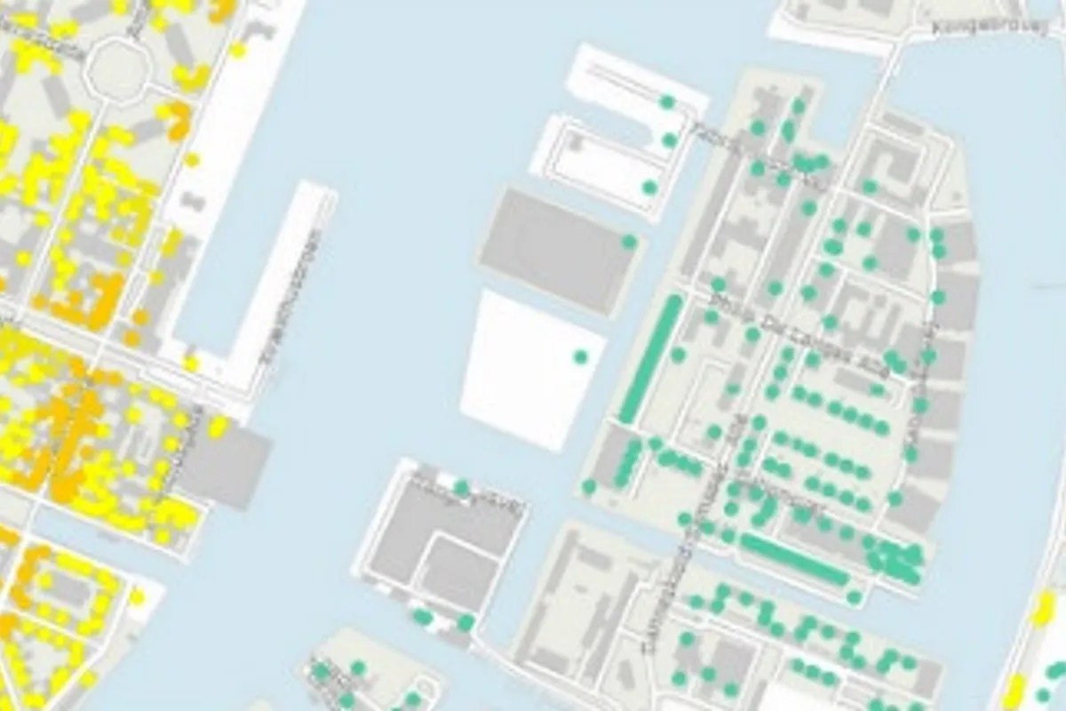
The green dot is a sign for good air on-site
Arhus University and DCE - Danish Centre for Environment and Energy (DCE - Nationalt Center for Miljø og Energi) created an online air quality map that shows concentrations of harmful air pollutants like NO2, PM2,5 and PM10. The data has been collected during 2012 from the facades of buildings in cities at the height of 2m.
The map indicates air pollutant levels for each building individually along with background concentrations representing the general pollution within an area.
According to an Arhus University report, the health of people exposed to air pollution is in risk of heart and lung diseases, lung cancer, asthma, limited activity, decreased birth weight and a reduced level of lung function in children.
Groups in danger are people living along busy streets and those already having heart or lung disease. In 2011 a DCE report on health impact concludes that 3500 premature deaths a year in Denmark are due to air pollution.

Copenhagen capital area
Another way to be informed about air quality state is the WHO global ambient air pollution interactive world map measuring air pollution levels in over 3000 locations worldwide.

World air pollution map
A WHO report in 2016 states that Ambient Air Polluiton kills about 3 million people annually and is affecting all regions of the world although Western Pacific and South East Asia are the most affected. About 90% of people breath air that does not comply with WHO Air Quality Guidelines.


